GDL
Revised Requirements (18/06/2025)
What this document covers
- Henry's proposed changes
- Our proposed changes
- Clarifications on certain things
- Implementation details
Table of Contents
I. Design
II. CMS
~ I ~
Design
Design
- Main content area
- List-ish sections
- Quotes
- Content container widths
~ 1 ~
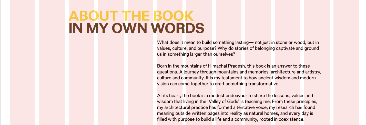
Main Content Area
What's changing?
- Have it span 9 columns on all pages.
~ 2 ~
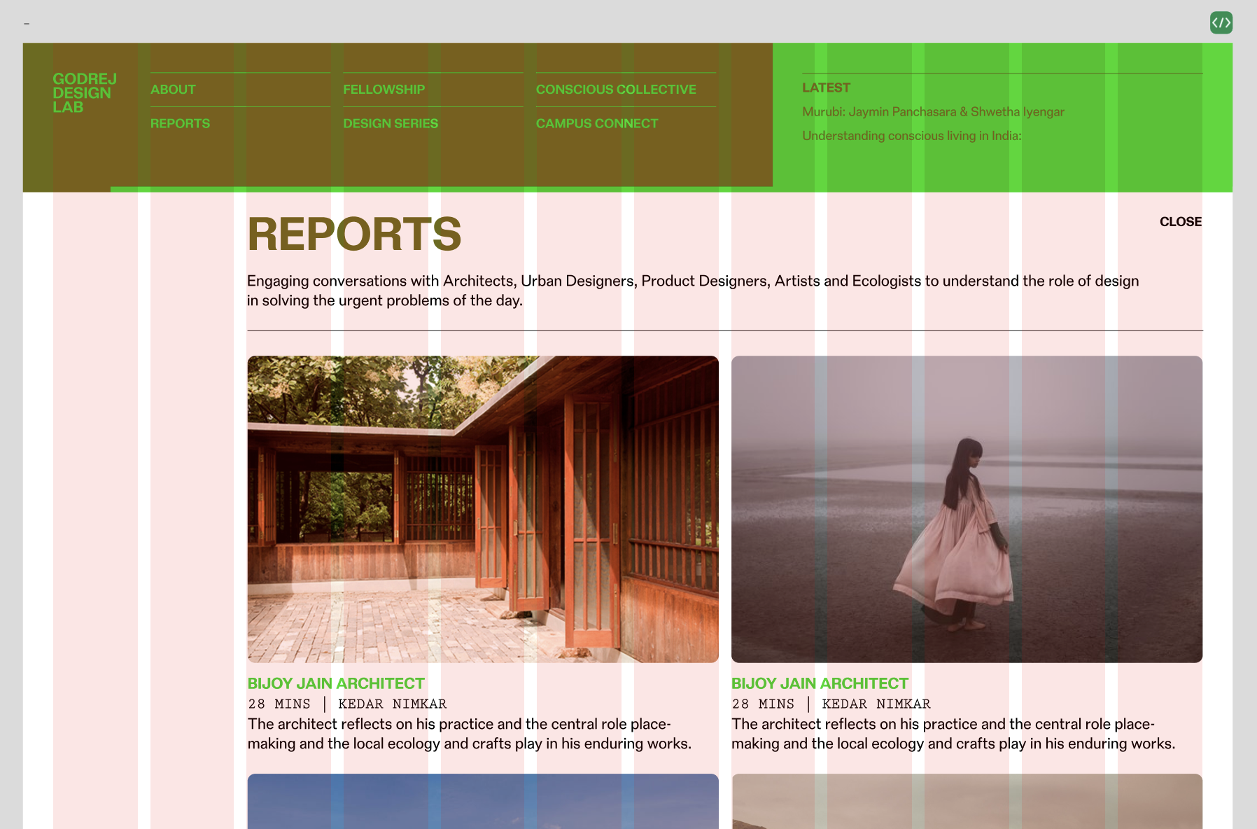
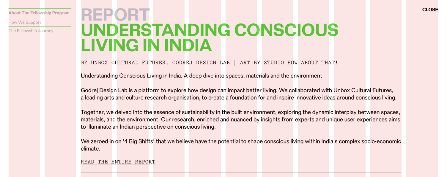
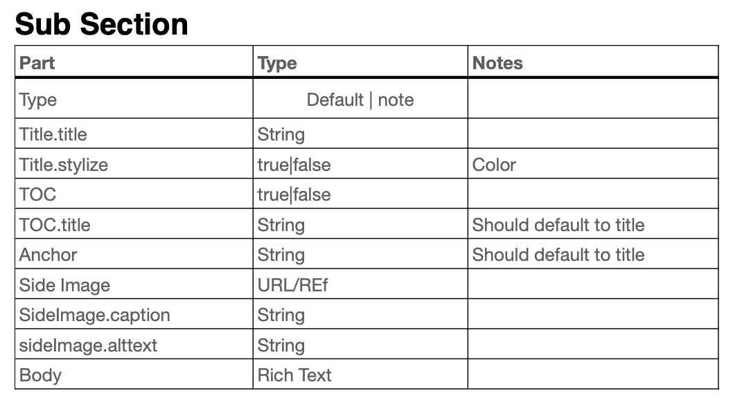
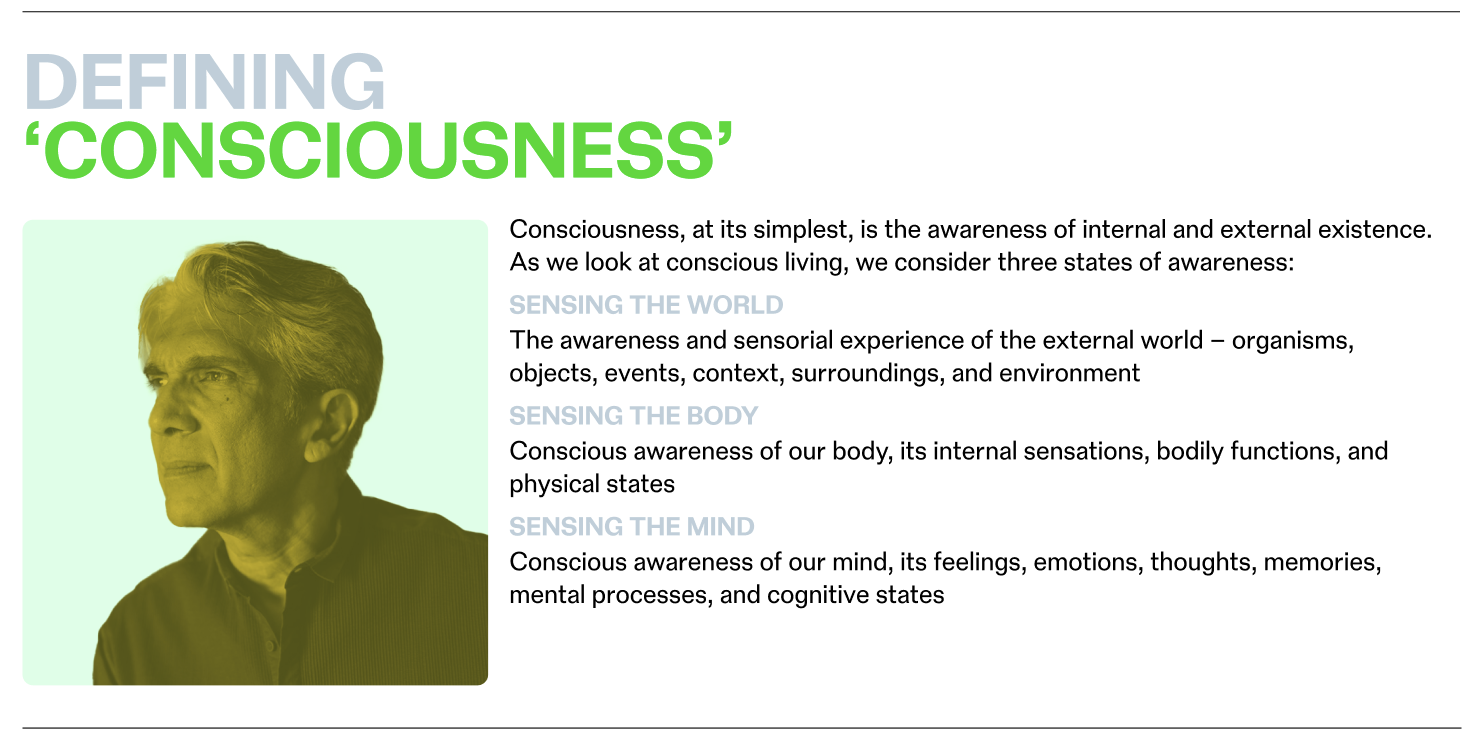
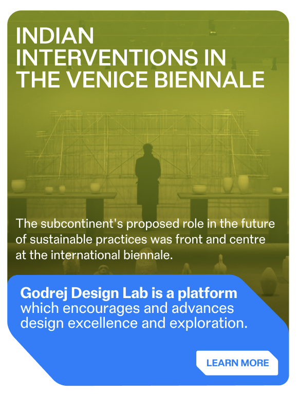
List-ish Sections
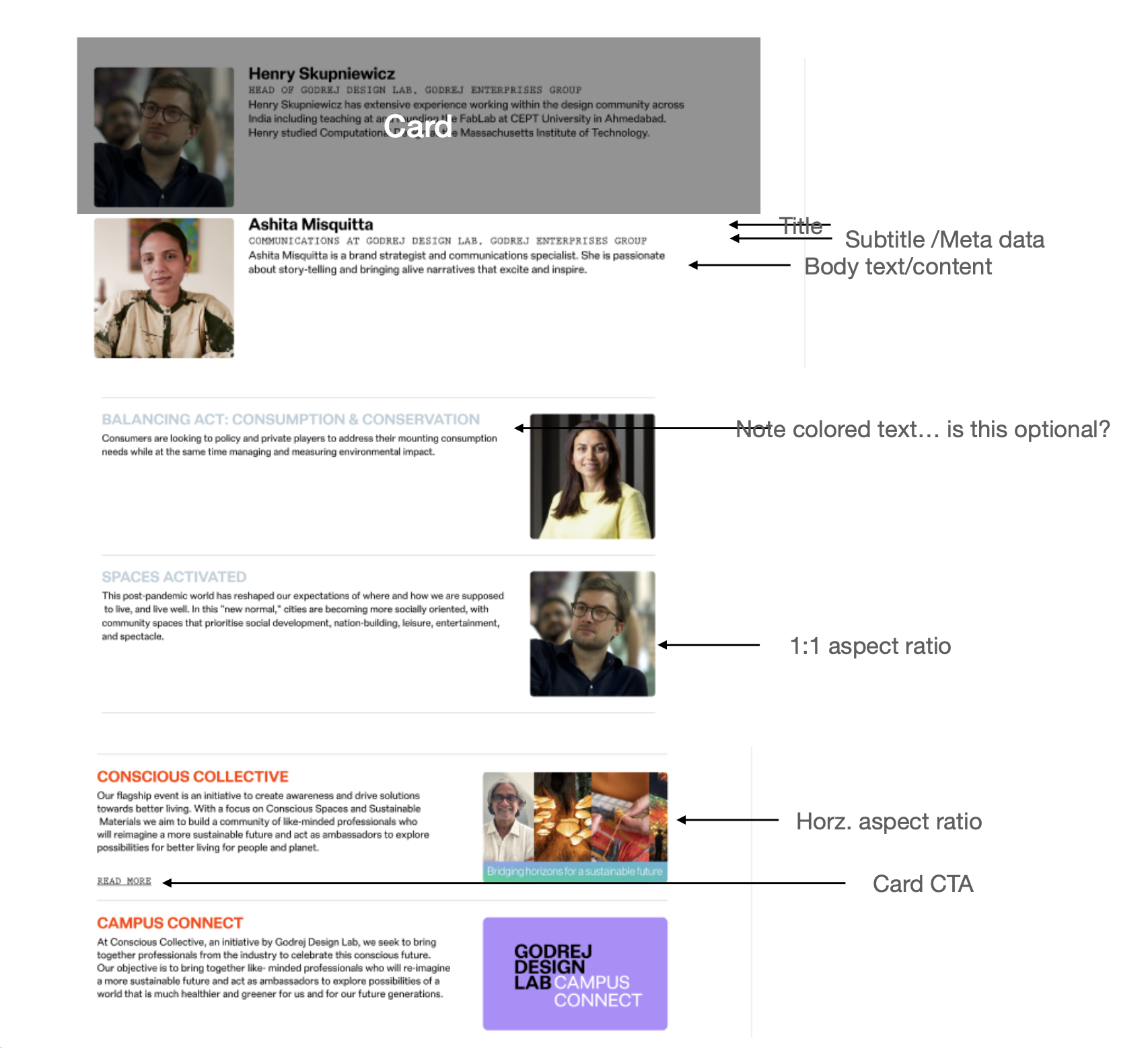
What's changing?
- Designs: This will be normalised (for the above displayed sections). The horizontal space that the image and the content areas take up will be pre-determined and won't be configurable.
- Horizontal rules: These will be automatically added in between list items.
- Heading color: This won't be configurable. Have to settle for Either black or the primary color. Will need a decision on this.
- Image alignment: Can be configured to be either on the left or the right
- Image width: Not configurable. Will always span 3 columns, regardless, and not 2 columns, or 2 columns + 1 gutter (as seen in the current design).
- Image aspect ratio: This remains configurable —
square (1:1)ornatural - CMS: This UI will be powered a new "Highlight Deck" component. More on that later.
~ 3 ~
Quotes
Clarifications
- Are quotes to be normalised as well? Or are both variations to be supported?
~ 4 ~
Content Area Widths
Clarifications
- Are both the
full-widthandnarrow-widthlayouts to be supported?
~ II ~
CMS
CMS
- Heading
- Section
- Image and Gallery
- WYSIWYG
- Featured post
- Layout
- Table
- Post list
- Post query
- Highlight deck
- Spec list
~ 1 ~
Heading
What's changing?
- The heading component will no longer be independently accessible. It will only manifest embedded within the section component. This is because they appear to be no scenarios where sub-headings would be need to implemented using a dedicated heading component.
- The heading text fields will be renamed to
line 1 (secondary color)andline 2 (primary color).
~ 2 ~
Section
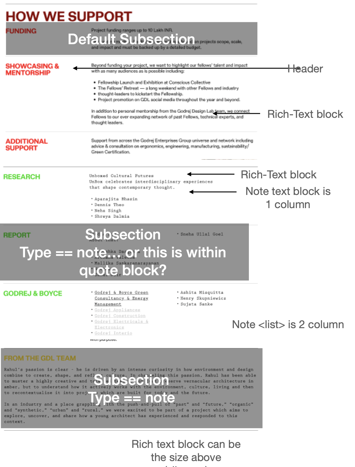
Response to the notes
Body field: This cannot simply just be a rich-text field.
A variety of designs/layouts need to be accommodated. And Strapi's rich-text field is:
a) Limited in what it can do, and
b) Is not extensible
Therefore, the field has to be a "container" to which various content blocks are inserted into. This is how it works presently.
What's changing?
Horizontal rule: One of these will automatically be included after the section's content.
Hence, no need to add one manually like how it is done now.
~ 3 ~
Image and Gallery
What's changing?
Image captions: Support for this can be added.
No design reference for this exists presently. But will whip up something basic and minimal.
~ 4 ~
WYSIWYG
What's changing?
- Spacing modes: Are both these spacing modes (normal and compact) to be supported?
~ 5 ~
Featured post
Clarifications
- Is the featured post portion a link? Or just inert content?
~ 6 ~
Layout
What's this?
These are the "1-column Layout" and "2-column Layout" components, which establish 1-column and 2-column layout contexts respectively.
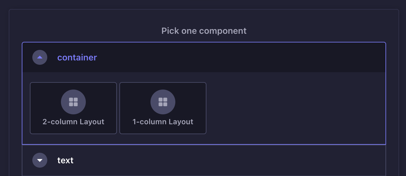
What's changing?
2-Column Layout
- This will be retained.
- Custom width-ratios: These will no longer be configurable. All 2-column layouts will have a 1:2 ratio.
- Purpose of column 1: Despite mentioning that the first column will only ever hold a square image, we will leave it as a generic content container. In the future, if more than just a square image needs to be added to the first column, it can be done.
1-Column Layout
This will be replaced with two new components — "Column (full-width)" and "Column (narrow-width)".
This depends on whether both these content widths need to be supported (see the "Content Area Widths" slide above).
~ 7 ~
Table
Proposed changes
- Number of columns: There's no limit to this.
- Columns names: These are specified explicitly.
Issues with proposal
- Column widths: How will this be determined?
- Columns stacking on mobile: The columns stack in an order different from what you see on the desktop.
- Horizontal rule b/w fellow names: This will no longer be possible. One will have to manually hit the Enter key and input the second name on the second line. But no horizontal rules will show up in between the lines.
~ 8 ~
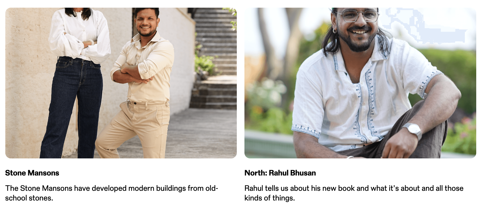
Post list
What's this?
- A new component, that replaces the existing post query component.
- One populates a list of "post tiles" — putting in a thumbnail, a heading, author byline, reading time, and an excerpt.
- This is similar (in concept) to what is already in place on the "Fellowships" page.
Schema
Component-level
layout: 2-column, 3-columnfeature_first_post: Makes the first post span the full-width
Post tile-level
imagecontent: a rich-text field that supports any kind of text content — heading, byline, excerpt
~ 9 ~
Post query
What's this?
This component is a "dynamic content block".
Ones specifies the content-type, a category and how many "posts" are needed (ex. 2), and a list of posts that meet the specified criteria will be returned (on the frontend).
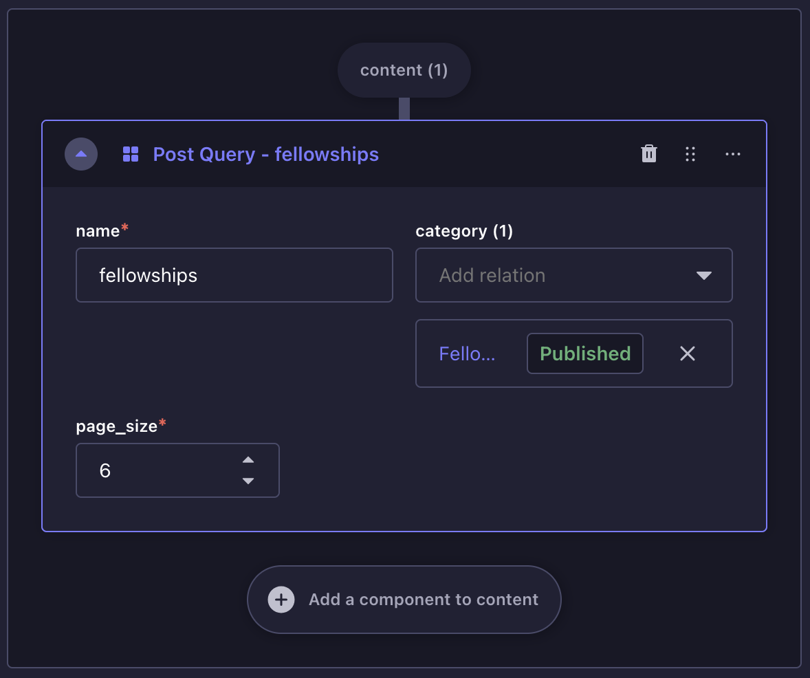
What's changing?
- This component will be removed and replaced with the "Post List" component that favours a manual construction of the list.
~ 10 ~
Highlight Deck
What's this?
- A new component that'll allow one to populate a deck of "highlights".
- A highlight comprises of an image on one side, and arbitrary text content on the other.
- This differs from the "Post list" component in that the content is inert and does not navigate away when clicked on.
~ 11 ~
Spec List
What's this?
- A new component, similar to the highlight deck.
- Instead of an image, there is a heading.
- Heading always goes on the left.
Issues
2-column bulleted list: This won't be possible unless the text content field is a generic content block container.
2-column layouts aren't possible within a rich-text field.